When Should I Use Reflowable Text in My eBooks?
Contents
It’s a term that gets thrown around a lot: reflowable text. But what is that, and how does it impact your book?
First, what IS reflowable text?
When a physical book is designed, a lot of attention is paid to how the lines on the page look. Do any of your words break in strange places? Do you end up with widows (a few words at the top of a page that end a paragraph) or orphans (a few characters sitting alone at the end of a paragraph). Are your chapters ending with just a line or two on the last page, or do you have the recommended 4+ lines? Do you have any stacks of words (three or more lines that all begin or end with the same word ). All of this is done to create an aesthetically pleasing book . . . and none of it matters one bit in a book with reflowable text.
Why? Because reflowable text is text that is not locked in place on your page. It is text that can “reflow” as you change the font size you choose to read at—or even the font you want the book presented in! Reflowable text is used in eBooks to give the reader more control over what they want their page to look like, but it makes it impossible to determine where you are going to end up with widows or orphans, or how long the ends of chapters are going to run, because with every new font size all of that changes.
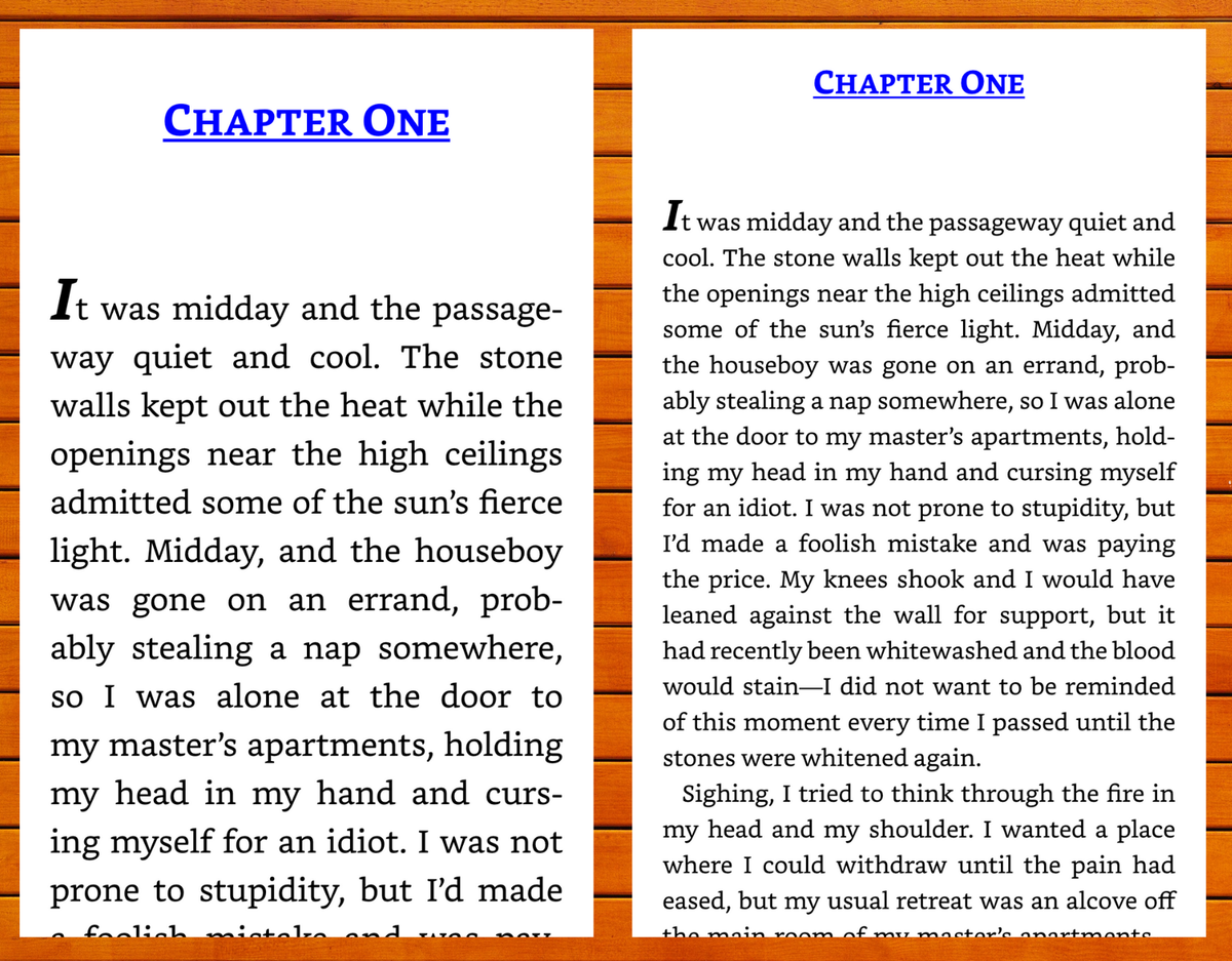
Take a look at these two examples from Thick as Thieves by Megan Whalen Turner. Here, as the font size decreases, the way the text fills the page changes.
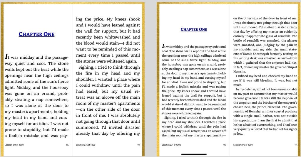
The question is, does the way the text shifts really matter? Is it a bad thing for those elements not to be in place? And the answer is, no, it’s not a bad thing. As long as it’s used on the right kind of book.
What is the right kind of book?
Reflowable text works best with non-illustrated books. Novels, memoirs, nonfiction that does not include graphs. That’s because the layout doesn’t matter. The text all flows through without having any impact on the reading experience.
But not all books work as well when the text moves around. Think, for example, about a picture book or graphic novel. Text in picture books and graphic novels is set very specifically and purposefully on the page. It is meant to go exactly where it is, and to move it would cause the book not to read right. Take a look at this example from Narwhal and Jelly. The panels need to sit exactly as they were designed. To change the font size would mean that the text wouldn't fit in the speech bubbles, and to increase the size of the panels to fit an increased font would throw off the whole design.
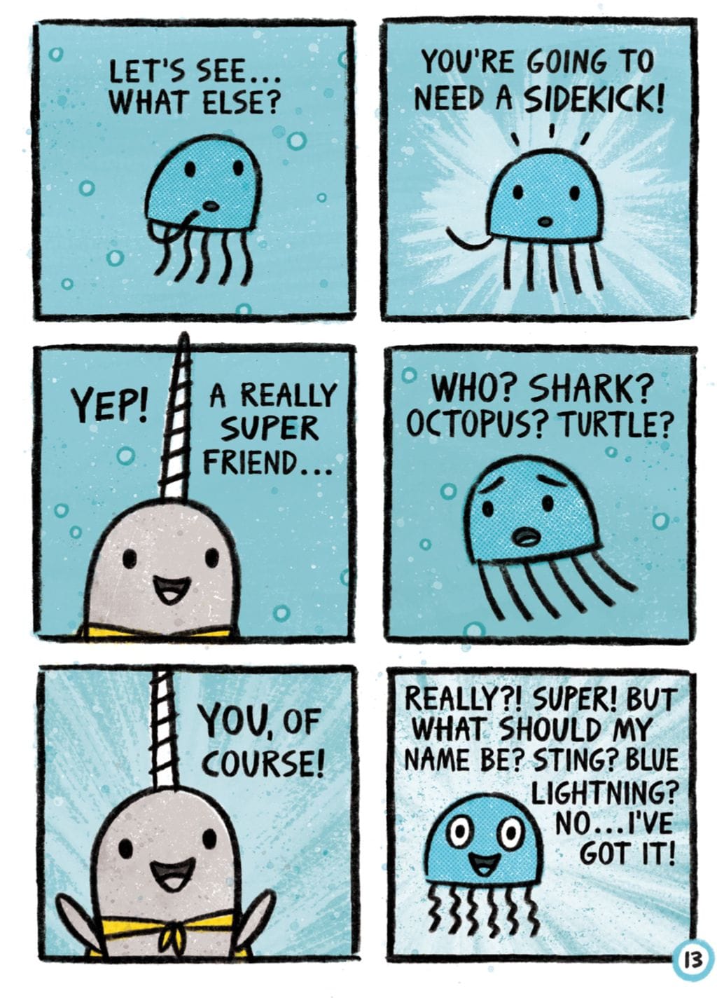
How about books with illustrations? What would happen if the text moved but the art didn’t? The story and the art would no longer line up, which would be confusing to the reader.
Or a cookbook? If the instructions were ten pages away from the photos that showed the steps, that would be a disaster!
So, what can you do? A few things.
Lock your art and text together
If you choose to use reflowable text, ask your designer to link the art and text together. Your designer should be able to set the images to resize as needed to stay with the text, regardless of where it goes in the book. Take a look at this example from Winnie the Pooh. As the font size changes, the art shifts to stay in line with the newly placed text.
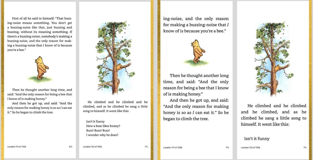
This isn’t always a perfect solution, though. Especially if you need art and text to overlay each other. If this is your choice, play with the file for a while before releasing it. Try it out with different fonts, and different point sizes and make sure nothing is going so wrong that it will ruin the reading experience.
Create a fixed format layout
Fixed format books are exactly what they sound like. The format is fixed. Font size can’t be changed. Font itself can’t be changed. And the page stays exactly how your designer laid it out.
Fixed format works particularly well for picture books or highly illustrated books like graphic novels. There is a downside, though: many retailers won’t allow you to use live fixed format files (and those who do often charge extra for downloads, as fixed format files tend to be larger than reflowable ones.) Amazon, for example, requires that fixed format files be uploaded into their own creator, which basically flattens the file into individual JPGs. If you’ve ever downloaded an eBook of a picture book and found that it loads a bit funny, that’s probably the reason why. Still, it’s a good option for picture books to ensure that layout stays exactly as it was intended, which is so important.
At the end of the day, the choice on reflowable text v. fixed format is yours. But ask yourself this question: who will likely be reading the eBook and on what device? Is it a novel, where the reader will want that freedom to read at a point size that works for their eyes? Or is it a parent who just wants to see if they like a story before they buy the physical book? The reflowable v. fixed format discussion all boils down to reader experience, and as the author, it’s up to you to decide what that experience will look like!
Not sure you want an eBook? Check out my article Publish an eBook to Drive Book Reviews and Book Sales.